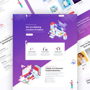
A website is not just a few Web pages plastered with content and images. It is your business’s virtual address, a platform where existing and potential customers can interact with your business. As you make sure to create an exciting environment in your office for your clients, the user interface for your website makes sure that the visitors feel welcomed and are easy to navigate through your site
Often while attempting to provide comprehensive information to the visitors, the user interface takes a back seat. This can be harmful in the long run as it discourages people from spending more time on your website. Here are 10 great ways to overcome some common UI issues:
1. Think about the user first
User-interface (keyword in focus being “user” here) is all about the user’s perception and experience for the website. The design, just like art, is subjective; everyone interprets it differently. Some designs may seem appealing to some, while others may not find it that pleasing at all. Consider who all your target audience are, what their preferences are, and based on that, choose your logo design as well as the website layout.
Get to know your user, their demographics, education, preferences, needs, and even the devices they would be using to browse your website. The user interface for Android and iOS can be different keeping in mind the device and screen specifications.
2. Identify how the users would be using your website
In addition to the user’s needs, it is also essential to develop the website and apps for touch-based devices considering the exponential increase in the use of such devices. Your layout must be responsive and adaptive for different screen sizes. This would ensure that the layout they view remains correct for all visitors. You can use the button click or swipe gestures and other forms of interactions with users.
3. Provide proper error messages
There may be situations when the users find themselves at dead ends while navigating through a website. It could be due to incorrect command, information submission, broken links, or missing pages. During such situations, error messages are displayed to the user communicating the issue. The correct way is to show the user what is wrong and how they can rectify it. For instance, simply stating that you seem to have reached a broken link, is not enough, share details of what went wrong and how the users can find the information they were looking for. This is one of the reasons why many websites have fun and interactive Error 404 pages to prevent the user from getting discouraged.
4. Keep the layout simple
A cluttered and complicated web page layout throws off the visitors. Nobody has the time to explore all nooks and corners of a website or read long texts. Keep the information ready and in a simple structure for the visitor.
5. Use contrast, fonts, and graphics to bring focus
Certain areas of the websites need to be highlighted more than the others. You can bring a visitor’s attention to such areas with the use of contrast. This could be accomplished by using contrast and a variation of font sizes. Contrast brings headline into focus, and the user can pay more attention to such text with ease.
For web pages with intensive text, add an attractive graphic design to break the monotony of the page and create a pleasing visual for the user. This graphic can be a call to action, product information, or related to the text displayed on the page.
7. Create seamless navigation
Often websites have numerous pages with all the information they wish to share with their users. These pages are interlinked; the visitors can move from one page to another by clicking on links provided in text or with the menu options in the header or footer. Make sure that the pages are linked logically so that the visitors do not get lost and can locate the needed information swiftly and efficiently.
8. Have a spot-on and swift feedback system
Feedback provides an excellent way for systems to improve and overcome the shortcomings. In the real world, this feedback can be received instantly, but for a digital interface, this becomes difficult. Add a loading animation, hi5 for successful transaction or submission, and so on. This conveys to the consumer what is happening and also adds to the entire user interface
9. Consider the clever placement of some key elements
If your call-to-action buttons are smaller, they are bound to get lost amidst the information on the webpage. Make sure your key elements are large enough for the user to see and graphics are alluring for them to bring attention to them. Placement of the key elements also depends on your webpage scrolling, whether it is horizontal scrolling or vertical.
10. Follow the set rules and standards always
The UI design rules and standards such as the placement, size, and orientation make sure that the visitor finds themselves in a specific familiar territory even when visiting a website for the first time. Visitors don’t like learning an entirely new process when they have gotten used to an existing system. Even if you are planning a complete overhaul of your website, make sure to keep some of the earlier elements for the ease of the visitors.
Adapt to customer feedback and analytics data
Keep an eye on your website’s analytics always. What is the bounce rate for each page, which pages are performing better and so forth? The feedback provided by users can also shed light on what they find, not up to the mark when they visit the website. Many websites prompt a small survey seeking user feedback to gain insight for UI improvement.
Just as you provide a comfortable atmosphere in a face-to-face meeting for the visitor to feel good and engage in a relaxed manner, the website experience also matters in nudging the user to the next stage. This is the user interface of your website. It includes how the visitor experiences the time spent on browsing your website. How easy it is for the user to move from one page to another? How easily can they find the information that they were seeking? Do they find the website design aesthetically pleasing? Using these 10 tips, you can overcome many UI issues and even reduce bounce rate, thereby helping your visitors spend fruitful time on your website.


