Web design trends come and go, so, the key to surviving online is to stay abreast with the current design trends. Every year, we see new algorithm updates, improved visuals and best practices in the industry. The techniques that worked in the past may need a bit of fine-tuning to work in the future.
Not too long ago, the ideal website was one that had a lot of elements such as flash, images and complex colours. Back then, the competition was all about who had the loudest website. In fact, it wasn’t out of place to hear a voice message playing immediately when you arrived on a website. Websites like this cannot survive in today’s internet environment. Nowadays, minimalist is the new trend in website design. Websites are now expected to contain only the elements that are necessary to the site visitor, but all this could change next year.
Even though 2018 is not yet over, content marketers are interested in knowing what a modern website will look like in the coming year. If the current trend is anything to go by, 2019 websites will focus more on delivering optimum user experience, fast page load speed, mobile friendly designs, exciting layouts, video backgrounds and more.
Staying on top of these trends is vital to the success of your business; after all, research shows that more than 46% of consumers judge the credibility of a business based on the design of its website. Therefore, following these trends will boost the credibility of your business, and will even help in improving your conversions.
In this article, we will be taking a look at some of the trends that will influence the modern website in the coming year.
Personalised user experience –
A personalised user experience will be one of the main focuses for 2019. Even though this concept has been around for some time, the rate at which people are becoming more dependent on their devices means that user experience has to reach a whole new level.
Focusing on a personalised user experience will help you reach the people that matter to your business and increase conversions. This means creating content and messages that will connect with your different customers based on factors such as their age, gender, location and preferences. If your website is able to provide this type of experience, your visitors will get the impression that you are actually taking care of them and their needs on a one-on-one basis.
This will make them want to do more business with you, resulting in more sales. Understand, though, that creating personalised UX requires an experienced touch. To craft the type of content that immediately resonates with the visitor based on their unique expectations; you may have to engage the services of a content writing company or hire a content creator. That being said, if your website fails to meet the individual expectations of your visitors, you will lose them to the competitor that can.

Brutalist web design –
In 2019, Brutalism is going to make a bigger bang than it has so far. For those of you who don’t know what brutalism is, it is a style of website design tailored after architectural designs. The idea behind Brutalism is that, since a website is essentially a digital version of what should be a physical business or structure, there is no reason why the website should not be designed based on real-world architectural principles.
Brutalism comes from the French word “Raw” and is a style of design that consists of:
- Repeated geometric patterns
- Asymmetrical grid designs
- Gigantic elements
- An exposed inner system
- Focus on practicality rather than beauty
With Brutalist websites, the focus is taken away from creating beautiful designs and given to creating practical designs, and, if done correctly, these websites will look good in their own unique ways.
Bloomberg and IKEA are examples of websites done using the Brutalism approach. If you visit these sites, you will notice that, while not exactly winning any beauty contest, you will have no problem getting the information you need in the shortest time possible. Brutalism will be good for businesses that want to engage the visitor immediately and pass on their message as fast as possible. Already, research has shown that the consumer’s attention span is dropping significantly, so it is not strange for brands to want to capture the attention of their customers quickly before it wanders.
Content-oriented experience –
Already, creating content targeted at meeting the user’s expectations is one of the benchmarks of a good website, but this trend will likely skyrocket in 2019.
Website users want a site that is fast, relevant and easy to use, no mean feat when you have lots of information to give, but the aforementioned short attention span of consumers has necessitated the need for content that passes on the message in the first few seconds of a visitor arriving to a website.
When content is visually appealing and user-friendly, it provides a better user experience that will be helpful with SEO. To this end, the websites of 2019 will contain little to no unnecessary elements, carrying only the content that is really useful, attention-grabbing and user satisfying, content that will not be overwhelming for the user.
Of course, achieving this may require a bit of investment in web content creation as you may have to get used to the idea of working with a content writer if you want to create the type of no-frills content that engages the visitor in seconds. This approach may be inevitable if you are aiming to create the perfect modern website that will meet the demands of tomorrow’s customers. Some of the signs of a perfect website in 2019 are appropriate content, uncluttered space, useful elements and a message that is easy to read, understand and act upon.
ChatBots –
Chatbots are not new to the internet. These vital artificial intelligence programs have been in use for some time now, but 2019 will see more websites implement them as part of their customer support system.Chatbots allow visitors to interact with your website, ask questions and get help when they need it.
Chatbots make it easy for visitors to do what they need to do on your website quickly and seamlessly, while at the same time helping your business save the money needed to pay a human agent. Chatbots serve as virtual assistants and are smarter, quicker and more responsive than human operators. Powered by artificial intelligence, chatbots help provide personalised experiences that will make website visitors think they are actually chatting with a real person.

Chatbots will be more popular among e-commerce websites and retail businesses as these websites need to engage more with visitors to their site.
Some of the greatest advantages of having a chatbot include:
- 24/7 availability
- Instant responses
- Ability to remember and recognise visitor’s preferences and visit history
- Ability to communicate with the visitor in their local language using user location to determine where the user is coming from
- Learns from customer feedback and adapts for future visits
In 2019, the number of websites using chatbots to carry out their customer support services will increase in order to provide improved communication between visitor and website.
Voice user interface –
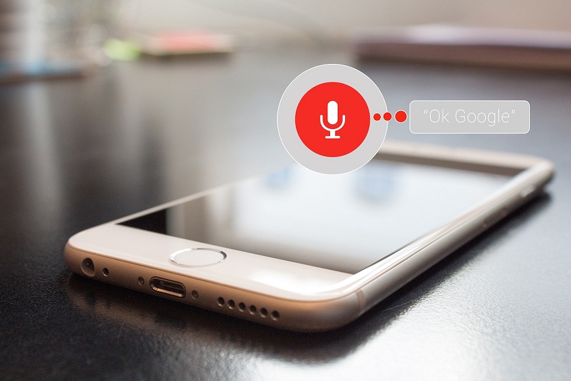
Today’s internet users are no longer tied to one spot, they are becoming increasingly mobile and this has necessitated that designs go beyond screen and keyboard inputs. It has already been proven that the number of people accessing content on their mobile devices far exceeds those that use desktop computers, therefore, the modern websites of 2019 will be designed to accommodate the mobile user who wants to access content on the internet while engaging in other activities, such as having a stroll. This will involve designing interfaces that recognise voice commands and can return the appropriate results.

Already, virtual assistants like Google Assistant, Apple’s Siri and Amazon’s Alexa are using this technology to provide users with the content they verbally request and we expect web and UX designers to follow suit in the coming months.
Voice user interface provides a means for users to access and interact with content in a hands-free manner. This will provide a different way for users to work with visual controls and will also help resolve the difficulties users encounter when working with small screen devices. If the increasing rate of voice searches is anything to go by, VUI websites will definitely be a reality in the very near future.
Micro-interactions –
Micro-interactions have been gaining a lot of traction in UX designs recently, especially in the area of mobile web development. This is a design style that allows specific interactions between website visitors and different elements on the website.
Twitter is a good example of a brand that is currently using micro-interactions to engage users. The visual and audio feedback that follows feed refresh is a good way to alert users about the changes they have made on the page. In the coming year, micro-interactions will play a huge role in user engagement. For example, a user’s Smartphone can return a haptic feedback or play a ‘swoop’ sound when the user clicks on a submit button. Little details like this provide a good user experience and can be the reason why people come back to your website.
It will also provide developers with useful insight about their programs and how they can make UX improvements for visitors.
Micro-interactions provide visitors with the tools they need to react appropriately to content on a website. Users can like or dislike a post using the thumbs up or thumbs down button, or any other emoticon representing their current feelings, just like is available on most social media platforms now.
Card or grid layout –
You have surely seen websites with card or grid layouts. A good example of this is Pinterest. This type of layout makes it easy to display your information in an easy to access way. With a grid layout, your website content is positioned neatly and is well aligned, making your website attractive and unique. Websites like this are increasingly common and there is no doubt that the number will increase significantly in 2019.
Card and grid layouts will work well for e-commerce websites, news and magazines, portfolio websites and blogs. These types of sites will also contain a lot of images and videos for better appeal, as text only will not be attractive in grid form.
A card layout will definitely add to a website’s user experience, making it easier for the visitor to get what he or she wants in very little time.
Conclusion
The trends covered in this article will define the way the modern website will look in the coming year. There is still a lot more to cover, but hopefully, the few listed above will give you an idea of what to expect. Your next step now should be preparing to implement all or some of these ideas in your website so that you can get a head start over the competition before next year.

