The Ultimate Guide to Creating Mobile App Wireframes
There are many stages to mobile app design and development; from ideation to design mockups to finalised UI. However the beginning of all award winning mobile apps starts with wireframes.
So if you are looking to develop either an iOS app or an android mobile app this ultimate guide to creating mobile app wireframes should prove useful.
What is a Mobile App Wireframe?
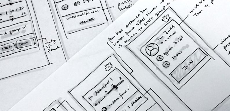
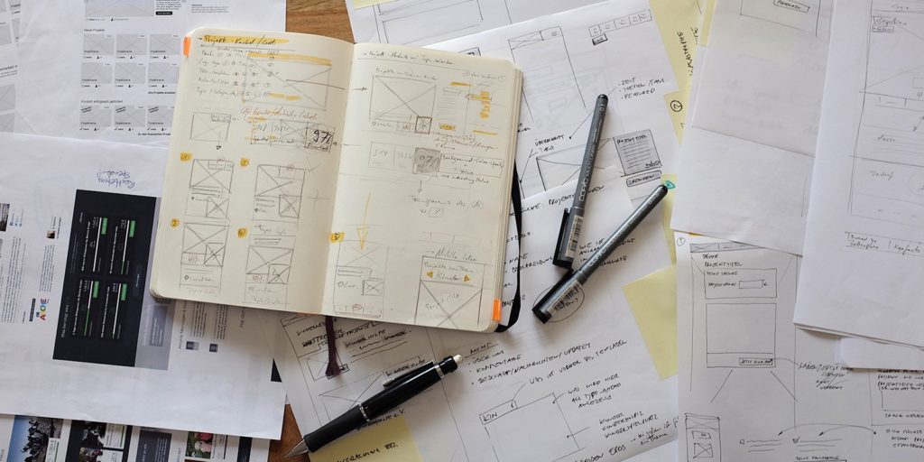
A mobile app wireframe is a rough sketch of you visualise your product in terms of layout. A wireframe is about defining the user journey, placement and navigation.
When designing mobile app wireframes, it is important to get a sense of which features will be included and layout placement and how they interact with one another. A wireframe is not a UI bible, but a jumping off point for product design.
Where to Start?
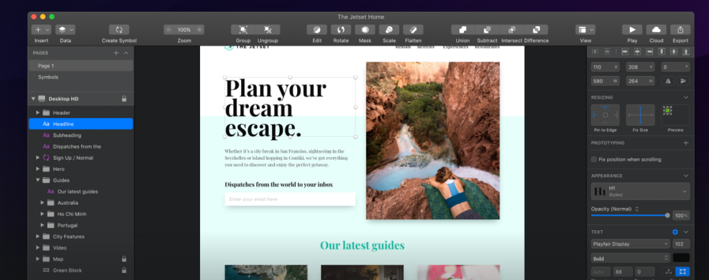
When our team of app designers take on a new project we begin almost all wireframes in a digital design tool called sketch. There are many ways to wireframe but this is a favourite for many app developers.
One of the main benefits of using sketch is that it allows teams of app developers to work in tandem with clients ensuring that everyone is on the same page. Regardless of whether you are designing an app for yourself, a client, or as part of a design team, this is the only guide on how to get started on creating mobile app wireframes you will need.
Much like many other app development companies our wireframe process has been refined over the years.
Today, we use the Sketch desktop app to easily share mobile app wireframes with our team and clients. The UI and UX design tool is a quick and easy default that all our designers are well versed in. Sketch is way more advanced than any other digital design tool kit when it comes to handling design systems, icon assets, and exporting to use in the app prototype phase.
Mobile App Wireframes – The Basics
If this is your first time creating mobile app wireframes then it is important to cover all of the basics. Here are some that you need to know.
Working in The Correct Confines
When wire-framing mobile apps for iOS or Android for that matter you must set up your Sketch to the most commonly used interface size for the platform.
It goes without saying but using the standardised sizes for all your design elements is a good idea. Users have already grown familiar with what they expect when it comes to a mobile app.
Use standard iOS fonts, in the correct sizes (15 and 17 pt). You don’t want to use small, unreadable text or cut necessary text if the font size is too big. This applies to designing buttons as well — they all must conform to the platform standards.
Put The User at The Heart of Your Wireframe
Each user interaction should be planned out in your app wireframe. It can be daunting trying to figure out how each success and failure is displayed.
- Where do you need a keyboard to pop up?
- How many possible paths is there to the end screen?
- How are you going to display forms?
This type of thinking is what mobile app wireframes are for – the further into the design process you are, the more difficult it becomes to address these issues and change what you already have.
Realise that Enterprise & Startups have Different Needs
Wireframes for Enterprise
When creating a mobile app wireframe for a larger enterprise business it can be like trying to piece together a 1000 piece jigsaw. An enterprise client will already have legacy systems, user base and most importantly of all a business strategy.
The developed mobile app from your wireframe will also have a greater expectation of providing ROI.
Wire-framing plays a crucial role in figuring out how this complex solution will fit together. You will have to consider a huge list of demanded features, integrations with API’s and services as well as client expectations.
Wireframes for Startups
Startup apps are the projects where we get the chance to build an MVP. This is a more iterative approach where we can start simpler and build out as we launch frequent updates.
For smaller apps, where the creativity of our solution might be the differentiator in that competitive landscape, we can immediately start experimenting with various interaction concepts.
The focus of the early for a startup wireframe is smaller in scale, features, and stakeholders, but we still need to put just as much effort and polish into the wireframe to create the foundations of the user journey.
How to Present Mobile App Wireframes
The mobile app wireframe presentation is about walking clients through the wireframe you have created while being able to clearly articulate your design decisions and give reasons for why you made that choice over the alternatives.
We want to be able to justify each decision, down to placement and size of buttons, where we put text, and any other user experience decision we have made.
You should be able to understand every nitty gritty detail of a wireframe in order to convey that to the client, and you should too that’s how the best mobile app wireframes are produced.
Mobile App Wireframes are not the the Holy Grail
Mobile app wireframes are great for estimating the proper budget and time that will be dedicated to features. They should not be treated as the holy grail of the app development process.
Once a wireframe is complete and you are moving on to mockups and visual design of the app, the wireframe does not need to change.
This however doesn’t mean you can’t make improvements and find new solutions to your original hypothesis, but it does emphasise that mobile app design and development is a continual process where each current prototype impacts your next design draft.


